Can your child actually get into that school from where you live?
That question has two halves, and most people only get to answer one of them. The map answers both on one screen. Pick any of the 182 primary schools in Singapore and it lays out what happened at every admission phase for the last seven exercises, 2019 through 2025. Then it draws the 1km and 2km priority boundaries and shows you the homes sitting inside them, with what they have been selling for by bedroom count. So you can see how hard a school has been to get into, and what an address inside its ring costs, before you plan a move around it.
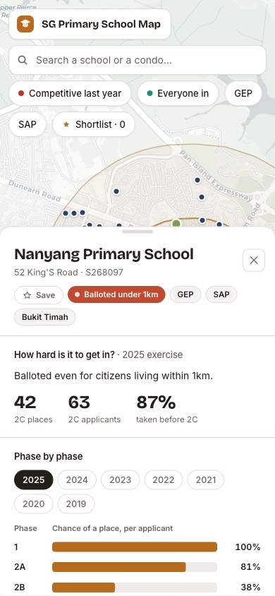
Plate 1 Nanyang Primary School in the 2025 exercise. 42 places against 63 applicants at Phase 2C, balloted even for citizens living within 1km, with 87% of the cohort taken before 2C opened. The two rings are the 1km and 2km priority boundaries; the dots inside them are housing projects.
What the map puts in front of you
URA and EdgeProp price snapshot
- 182 schools, seven years of ballots
Every primary school in Singapore, with the published results of each admission exercise from 2019 through 2025 sitting behind it.
- 5 phases, read one by one
Phase 1, 2A, 2B, 2C and 2C(S), each with the places offered, the applicants who turned up, and the chance of a place per applicant in that year.
- 1km and 2km priority rings
The distance boundaries drawn on the map around any school you pick, so you can see which side of the line an address actually falls on.
- $psf for the homes inside
The housing projects sitting within each ring, with prices per square foot by bedroom count, so the question of what an address inside the ring costs has a number attached.
- 4 ways a school reads at a glance
Balloted under 1km, safe under 1km only, a squeeze beyond 2km, or everyone in. Colour-coded across the island before you click anything.
On the data The ballot figures are MOE's published registration results for each exercise, carried across as reported. The housing prices are a snapshot built from URA and EdgeProp transaction data and move as new transactions land. Past ballots describe what happened in those years, not what will happen in yours: places, applicant numbers and priority rules all shift. The map is built to show you the pattern and the odds behind a school, which is a better footing for a decision than a rumour, and it is not a prediction of your child's placement.
You are nearly there
Access to the map is set up personally, so the numbers arrive with the context to read them. It takes three short steps, and if a school or an address is already on your mind, Alvin's questions are welcome at any stage.
- 1 Leave your details below.
- 2 Verify your mobile number with a one-time code.
- 3 Your personal map link arrives in your email.
You are in.
Here is your personal link to the Primary School Ballot Map. It is yours to keep, so save it somewhere you will find it again.
Open my mapOpening your map now.
When you are ready to talk through a specific school, an address, or how a 1km ring sits against your budget, Alvin is one message away. Until then, the guides and public tools are open whenever you want them.
Alvin Ang, CEA Reg. No. R070995I, PropNex Realty